Work copyrights and done for "Honedon Agency"
A food chain founded on authentic principles and a healthy blend between the traditional and the modern.
Starting off with logo I designed, I used a modern typeface as a backbone for the whole logotype but tweaked the shapes by hand to give it the natural cheesy melting look without losing the character of the brand.
The colors I picked, sweet yellow and green are simple, yet tell a lot. The yellow represents the cheese which is the main product of this brand, the very famous raclette cheese from Switzerland. Then I added green as a secondary color to imply that it’s not a brand that will serve unhealthy food since you have many choices of vegetable toppings to pick from. The supporting colors: pink, blue, and purple were added just to give the brand more creative space to breathe and experiment on different mediums.
My intention was to make something that will instantly be noticeable as to what brand it is but also not too juvenile or unreadable. Building on the attributes of the Easy Cheesy brand, i created a secondary mark that is perfect for app icons, favicons, and smaller tight spaces. The melting handmade type gives you that handmade not store bought* product feel and also communicates the brand values perfectly as a ancient tradition but with a modern twist to it
For the visual language, i looked to what Easy Cheesy is known for: High quality products, healthy and out of this world delicious. And when you have a brand that has these key qualities it just makes your work so much easier at picking the right visual language. That's why i went with the handmade melting lines and patterns that are perfect for using everywhere on materials such as: packages, merch, stickers, printed and online ads.
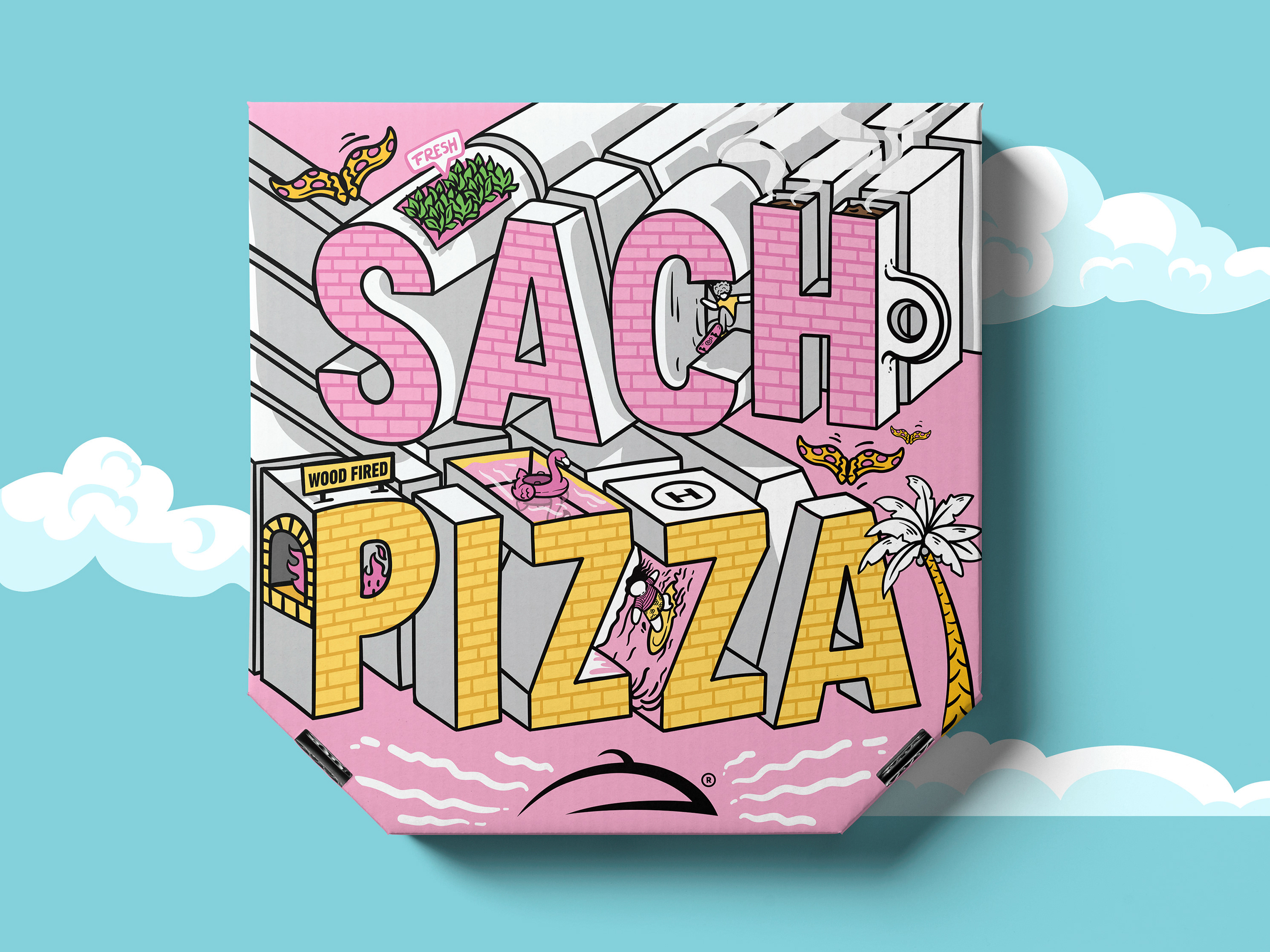
The package design job was also my responsibility and I approached it with the same style as I did with the logo. I added the extra colors in the stickers, pink, blue, and purple just to give the brand more space to create different packages.
